Sunday, November 4, 2012

Squeak Carnwath

"Is Here There," 2012, by Squeak Carnwath, is posted below.
There are two main elements to Carnwath's work, the graphic and the text. What really interests me is the latter, the text. Her graphics are colorful yet simple, using muted shades of a variety of colors in doodlesque forms. On it's own, the graphics would not hold my interest. Carnwath's decision to include handwritten text, however, adds a whole different layer of complexity. Her text is all in black, with some letters written improperly and a mix of capital letters and lower case letters.

The decision to place the text in the bottom right corner of the piece gives it more of a graffiti-like feel, particularly because of the inconsistent nature of the writing. Considering the piece as graffiti makes more sense, as the colored blocks then take on the look of bricks. Even Carnwath's choice of a saying seems to fit the graffiti theme. I would not necessarily think to include text in a piece, especially varying the form of the text, but it seems to be the cohesive element to this piece.

Lucien Freud

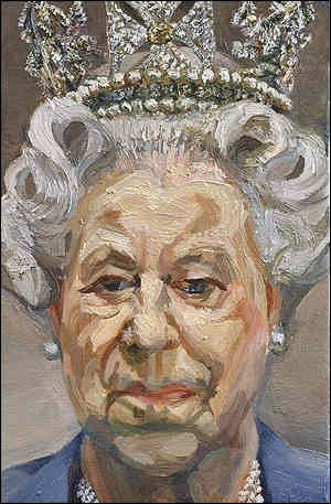
Lucien Freud paints portraits such as the one posted above, "Portrait of Queen Elizabeth II," 2001. As we are approaching our self portrait assignments in basic painting, I figured that it would be a good choice to address a portrait artist. What caught my eye about Freud's work is his approach to skin tones. Traditionally, people aim to paint perfect skin, to a photographic level. Freud, on the other hand, paints skin in segments. Areas with lines or shadows are obviously painted in darker shades, and the darkest areas are approaching blue in tone. The highlights on the face, on the other hand, near white, serving to create a broad range in skin tones. What strikes me about this way of painting is that despite the fact that Freud is painting segments at a time, Queen Elizabeth's face is still very identifiable, not just because she's wearing a crown.

Freud's choice in terms of composition is also very interesting. He placed Queen Elizabeth in the very middle of the 9 inch by 6 inch canvas, much in the same way that headshots or school portraits are done. Adding the basic background gives this painting a more official feel, as it places the emphasis on the subject matter and nothing else.

Mark Rothko

Mark Rothko is a minimalist painter, whose work mostly consists of colored background with soft rectangles in other colors on top. "White Center," 1950, is posted below.
I am not generally a huge fan of minimalist or abstract paintings, but I have realized that I do not mind color blocked paintings like the one posted above. In "White Center," Rothko utilizes an orange background, with purple, yellow, red, black, and white. Rothko has a good color sense, not using dissonant shades of these colors. If the purple was more blue than it is red, it would not mesh as well into the painting. Instead, the red tones in the purple and the red tones in the orange compliment each other. The red underneath the yellow serves to create an obvious definition between the yellow and the orange. Rothko serves as a good example of why mixing our own colors creates better results.

Terry Winters

"Double Gravity," 1984, is the piece of art posted above. It was painted by Terry Winters, and reminds me of the geodesic paintings that we did as our first piece in basic painting. Winters' shapes in "Double Gravity" are not overwhelmingly intricate, but most of them do seem to have a defined space, particularly the largest form, at the top of the page. I think what makes this form seem the most solid is Winters' use of paint, layering it on heavier in some of the segments, while leaving others a paler yellow. The parts painted with an impasto-like technique have more weight, seeming to sink further back.

What I like most about "Double Gravity" however is Winters' resolution of the background. While the forms do not seem to be sitting on a surface, the lower left being brown instead of the grey or white does serve to ground the painting. The darker segments surrounding some of the forms add interest to the background, and serve to break up the rest of the white. Finally, I like how the whiteness of the background is not constant, as it fills the space around the forms, and keeps the viewer's eye moving around the painting. As I personally struggle with backgrounds, I think I could learn something from Winters' handling of hers.

Brice Marden

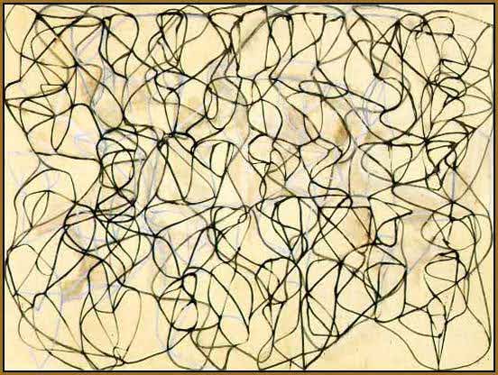
Brice Marden's work is mostly layered linework, such as in "Cold Mountain Painting," 1989-1991, posted below.
Marden's work involves subtle layers, with a muted white layer behind the top black one. The muted nature of the white lines helps to create depth, as they appear to be in the distance. As for the linework itself, it seems to be very uniform in thickness, with darker areas only resulting from multiple lines intersecting.

Marden's work reminds me of Jackson Pollock, who I posted about earlier, as they are both abstract artists whose work mostly deals with layers and lines. Like with Pollock, I understand that Marden must have a process behind all of his works, it just is not evident to me as a viewer. As an artist, I do not feel that there is very much that I can get from Marden's work, as it is very different from any work that I myself may do.

Wednesday, October 31, 2012

Sean Scully

The piece posted above is Sean Scully's "Raval Rojo," painted in 2004. Scully is yet another artist who does blocks of color, which I typically do not like. These blocks of color I do not mind as much, however, because they are less precise and more organic. He lets the white of the canvas show through between the blocks, and his brush strokes are visible as well. I feel that this leads the eye around the canvas more effectively, holding my attention for longer.

When searching Scully, there were not only images of just his art, but also images from some of his gallery shows. When he hangs these pieces, he hangs them surrounded by copious amounts of white wall space, framing and isolating them. The white space makes the colors pop, especially when the pieces are backlit. I never think of pieces hanging without a frame or a mat, so it is interesting to think of the wall as framing a piece by itself. When matting a piece, you have the option of doing black mat or white mat, but gallery walls are normally just white, so not using a mat would generally eliminate the possibility of a colored border to the piece. Either way, looking at Scully's work made me give more consideration to the presentation of pieces, not just their making.

Alex Katz

Unlike all the other artists I have posted about thus far, Alex Katz is primarily a portrait painter. Below is posted "Eli's Friend," 1985.
This painting seems to be more of a sketch, as most of his other paintings have a more finished quality to them. What attracts me about this painting more so than the others, however, is exactly that. I like how the vest is not completely red and the plethora of highlights in the hair give it body. The bright yellow outline of the face and neck, on the other hand, I neither like nor understand. Even accepting that this could be a sketch, I see no purpose to it, but rather find it distracting, particularly around the left eye.

Katz's sense of composition seems to be more developed in his other works, with subjects not centered on the page, in poses that aren't entirely frontal. The composition of this painting reminds me of school picture day, where everything from shoulder level up is cropped out of the frame. Were Katz to combine this looser style of painting with the composition of his other works, I would consider that to be a successful piece.