Sunday, November 4, 2012

Squeak Carnwath

"Is Here There," 2012, by Squeak Carnwath, is posted below.
There are two main elements to Carnwath's work, the graphic and the text. What really interests me is the latter, the text. Her graphics are colorful yet simple, using muted shades of a variety of colors in doodlesque forms. On it's own, the graphics would not hold my interest. Carnwath's decision to include handwritten text, however, adds a whole different layer of complexity. Her text is all in black, with some letters written improperly and a mix of capital letters and lower case letters.

The decision to place the text in the bottom right corner of the piece gives it more of a graffiti-like feel, particularly because of the inconsistent nature of the writing. Considering the piece as graffiti makes more sense, as the colored blocks then take on the look of bricks. Even Carnwath's choice of a saying seems to fit the graffiti theme. I would not necessarily think to include text in a piece, especially varying the form of the text, but it seems to be the cohesive element to this piece.

Lucien Freud

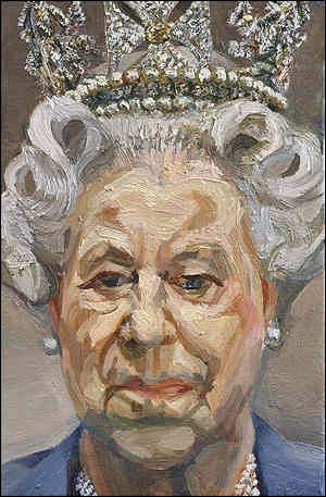
Lucien Freud paints portraits such as the one posted above, "Portrait of Queen Elizabeth II," 2001. As we are approaching our self portrait assignments in basic painting, I figured that it would be a good choice to address a portrait artist. What caught my eye about Freud's work is his approach to skin tones. Traditionally, people aim to paint perfect skin, to a photographic level. Freud, on the other hand, paints skin in segments. Areas with lines or shadows are obviously painted in darker shades, and the darkest areas are approaching blue in tone. The highlights on the face, on the other hand, near white, serving to create a broad range in skin tones. What strikes me about this way of painting is that despite the fact that Freud is painting segments at a time, Queen Elizabeth's face is still very identifiable, not just because she's wearing a crown.

Freud's choice in terms of composition is also very interesting. He placed Queen Elizabeth in the very middle of the 9 inch by 6 inch canvas, much in the same way that headshots or school portraits are done. Adding the basic background gives this painting a more official feel, as it places the emphasis on the subject matter and nothing else.

Mark Rothko

Mark Rothko is a minimalist painter, whose work mostly consists of colored background with soft rectangles in other colors on top. "White Center," 1950, is posted below.
I am not generally a huge fan of minimalist or abstract paintings, but I have realized that I do not mind color blocked paintings like the one posted above. In "White Center," Rothko utilizes an orange background, with purple, yellow, red, black, and white. Rothko has a good color sense, not using dissonant shades of these colors. If the purple was more blue than it is red, it would not mesh as well into the painting. Instead, the red tones in the purple and the red tones in the orange compliment each other. The red underneath the yellow serves to create an obvious definition between the yellow and the orange. Rothko serves as a good example of why mixing our own colors creates better results.

Terry Winters

"Double Gravity," 1984, is the piece of art posted above. It was painted by Terry Winters, and reminds me of the geodesic paintings that we did as our first piece in basic painting. Winters' shapes in "Double Gravity" are not overwhelmingly intricate, but most of them do seem to have a defined space, particularly the largest form, at the top of the page. I think what makes this form seem the most solid is Winters' use of paint, layering it on heavier in some of the segments, while leaving others a paler yellow. The parts painted with an impasto-like technique have more weight, seeming to sink further back.

What I like most about "Double Gravity" however is Winters' resolution of the background. While the forms do not seem to be sitting on a surface, the lower left being brown instead of the grey or white does serve to ground the painting. The darker segments surrounding some of the forms add interest to the background, and serve to break up the rest of the white. Finally, I like how the whiteness of the background is not constant, as it fills the space around the forms, and keeps the viewer's eye moving around the painting. As I personally struggle with backgrounds, I think I could learn something from Winters' handling of hers.

Brice Marden

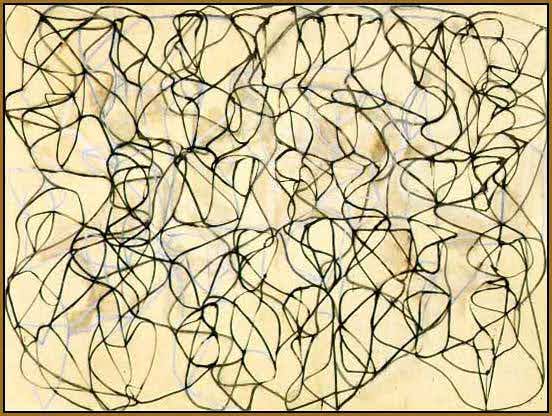
Brice Marden's work is mostly layered linework, such as in "Cold Mountain Painting," 1989-1991, posted below.
Marden's work involves subtle layers, with a muted white layer behind the top black one. The muted nature of the white lines helps to create depth, as they appear to be in the distance. As for the linework itself, it seems to be very uniform in thickness, with darker areas only resulting from multiple lines intersecting.

Marden's work reminds me of Jackson Pollock, who I posted about earlier, as they are both abstract artists whose work mostly deals with layers and lines. Like with Pollock, I understand that Marden must have a process behind all of his works, it just is not evident to me as a viewer. As an artist, I do not feel that there is very much that I can get from Marden's work, as it is very different from any work that I myself may do.

Wednesday, October 31, 2012

Sean Scully

The piece posted above is Sean Scully's "Raval Rojo," painted in 2004. Scully is yet another artist who does blocks of color, which I typically do not like. These blocks of color I do not mind as much, however, because they are less precise and more organic. He lets the white of the canvas show through between the blocks, and his brush strokes are visible as well. I feel that this leads the eye around the canvas more effectively, holding my attention for longer.

When searching Scully, there were not only images of just his art, but also images from some of his gallery shows. When he hangs these pieces, he hangs them surrounded by copious amounts of white wall space, framing and isolating them. The white space makes the colors pop, especially when the pieces are backlit. I never think of pieces hanging without a frame or a mat, so it is interesting to think of the wall as framing a piece by itself. When matting a piece, you have the option of doing black mat or white mat, but gallery walls are normally just white, so not using a mat would generally eliminate the possibility of a colored border to the piece. Either way, looking at Scully's work made me give more consideration to the presentation of pieces, not just their making.

Alex Katz

Unlike all the other artists I have posted about thus far, Alex Katz is primarily a portrait painter. Below is posted "Eli's Friend," 1985.
This painting seems to be more of a sketch, as most of his other paintings have a more finished quality to them. What attracts me about this painting more so than the others, however, is exactly that. I like how the vest is not completely red and the plethora of highlights in the hair give it body. The bright yellow outline of the face and neck, on the other hand, I neither like nor understand. Even accepting that this could be a sketch, I see no purpose to it, but rather find it distracting, particularly around the left eye.

Katz's sense of composition seems to be more developed in his other works, with subjects not centered on the page, in poses that aren't entirely frontal. The composition of this painting reminds me of school picture day, where everything from shoulder level up is cropped out of the frame. Were Katz to combine this looser style of painting with the composition of his other works, I would consider that to be a successful piece.

Peter Halley

Peter Halley's work is all blocks of color, such as "Six Prisons in Color," 2004, posted below.
Unfortunately, I can not say that I'm a fan of this style of art. I do not stand the appeal of painting blocks of color, and it is not something that I would choose to decorate with. However, that is just my personal opinion.

For the piece posted above, Halley made an interesting choice with the colors. The tones he used together are all rather discordant and jarring to the eye. The vibrance of the colors makes each of the six main blocks look like they are misaligned with each other, like they are all slightly off-kilter. While I mentally know that this is not the case, the aesthetics of it make it difficult to see what I know to be true.

Donald Sultan

Donald Sultan is another artist who works in a minimalistic style. His piece "Pomegranate" is posted below.
This work is an etching, and like many of his other pieces, is part of an edition - this is one of sixty. Surprisingly, this piece is 48 inches by 36 inches, and as such probably has a different impact than I am getting from the small image on a computer screen. Sultan also does screen prints, and tends to use one or two colors with blacks and whites, which adds a dramatic flair. Such high contrast has a tendency to draw attention, and is a technique that I myself use in digital work.

I haven't ever done etchings or screen prints, but I love the graphic quality of the images that are made utilizing these techniques. One of the things that I really enjoy about Sultan's work is that he makes sure to maintain interesting compositions, not having everything central to the page. On some of his screen prints, the images even bleed over the white border, disrupting the clean line but drawing the viewer's attention. While I think this can be an effective technique, it is important to make sure that it is done with intent, so it does not look sloppy, which Sultan does successfully achieve.

Kara Walker


Some of Kara Walker's most prominent works are cut paper silhouettes done on a massive scale. She generally addresses identity and gender issues, particularly for African American women. However, Walker does use graphic imagery for these silhouettes, which has a tendency to cause controversy.


"Virginia's Lynch Mob," 1998, is posted above. In it you can see not only the large scale that Walker posts on, but the graphic nature of her pieces. Not only is there a person hanging upsidedown from a stick, but there is an image of a boy blowing his brains out with a shot gun. It would take me a lot of courage to make images such as these, especially anticipating the potentially negative feedback I would receive on them.

In my fundamentals of art and design class last semester, we did a project using contact paper to make solid black forms to stick to things. I then used my leftover contact paper to make an elephant decal for my laptop. One of my biggest difficulties with both the assignment and my personal side project was cutting out the small details, not to mention sticking them down without accidentally tearing them off. I can not even imagine how Walker accomplished this. I really enjoy the aesthetic of these silhouettes, though, and intend on incorporating something similar into work I do in the future.

Elizabeth Murray

Elizabeth Murray's art is very bold and vibrant, and to be entirely honest, I love it. It does seem rather juvenile upon first glance, but that is part of it's appeal. Murray's work makes for a nice break from more traditional oil paintings.
Posted above is Murray's "The Sun and the Moon," painted in 2005 on oil on canvas on wood. She paints on these wood pieces and then cuts them out and assembles her works in layers, adding a three dimensional quality. This adds extra intrigue because there are then shadows cast upon lower layers, with the shadows altering based upon lighting.

What really shocked me about the piece posted above is that it is 117 inches by 107.5 inches in size. I am 63 inches tall, meaning that this piece is twice my size, not accounting for the fact that it would presumably be hanging above floor level. I feel like it would definitely require a change of pace to work that big, and it's something I would eventually like to try.

Jackson Pollock

The first in-person exposure I had to Jackson Pollock was in my junior year of high school. My art class took a class trip to the Museum of Fine Arts in Boston, where there was a special Chinese exhibit. The focus of this exhibit was sumi-e, so I and the rest of my class were rather surprised when we turned a corner and saw a Jackson Pollock work much like the one pictured below (Number 1, 1950). 
What was even more surprising was that the MFA chose to mount it horizontally, so the viewers were looking down on the flat painting. As our tour guide explained, however, this was to emphasize the connection between the methods of Chinese painting and Pollock's work. Pollock systematically worked in layers, planning out what order he would place the colors in, and what spaces he would fill with each color.

Part of what I like about Pollock's work stems from having this knowledge. Upon first glance, Pollock's work looks like splatter paint, something I could do at summer camp. It appears chaotic and disorganized, with no real focus. Understanding that there is a process behind each work allows me a greater appreciation, taking notice of the negative spaces and color palette. While I would not necessarily choose to emulate this style of work, I think Jackson Pollock is one of those artists that emphasizes the importance of intention and forethought, which are two things that I can use.

Tuesday, October 30, 2012

Pat Steir

Pat Steir is a painter, but deceptively so. In order to determine which artists to feature for my research, I searched them on google images. When I searched Steir, I found image upon image of water, which I initially assumed to be sculptural. Upon closer inspection, however, these images were painted.

Some of Steir's early work, such as "Nothing," which is oil painted on canvas in 1974 (posted below), deals with symbols.
Specifically, Steir stated that she "wanted to destroy images as symbols." In order to do so, she painted the image, and then crossed it out. While the physical product does not relate to my artistic experience, the concept does. Much of what we learn in basic drawing and painting classes is to illustrate what is present, not what we think is present. For example, we all grow up with the knowledge that a face is round, with two eyes, a nose, and a smiling mouth. When it comes time to do self portraits, however, this basic knowledge no longer satisfies. Instead, we must focus on the shape of the jaw and the hairline, the fullness of the lips and the prominence of the nose. We are forced to stop painting what we think we know and paint what really is, or end up with an unsatisfactory product.

Steir's later work contains many of the water images that I referenced earlier. One of these pieces is a triptych entitled "Foss," painted in 1993 and posted below.
What really strikes me about these water pieces is how realistic they are. One of my biggest struggles with painting is texture, particularly in things such as folds, and getting them to look realistic. "Foss" is so impressive to me because it could be water falling, or it could be frozen ice. Either way, it looks like something you could reach out and touch.

Another one of the art classes that I am taking this semester is 3D Design, and our last project dealt heavily with texture. We had to look at images and figure out how to recreate a texture on a three dimensional level. The image in the middle of the triptych would be one of the easier ones to do this from, as the highlights and lowlights would serve as guides for where to carve out and where to leave elevated. The fact that I think I would be able to translate a painting to a three dimensional piece, simply based on the attention given to said painting, is absolutely astounding.

Agnes Martin

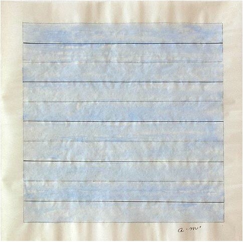
Agnes Martin is one of those artists were I look at their work and think "I could have done this!". The only problem here is that I didn't. She is an abstract minimalist, and while she does have some other works, I focused primarily on her squares and lines. Below is posted an untitled watercolor from the early 1980's.
I am not normally a fan of abstract art, so I was surprised to find myself drawn to her work. I do not look at it to analyze it or find a deeper meaning, but simply to look and pick up the details that I missed the first time. I think one of the reasons that I did take a second look was that she has a tendency to use a square format, which is a tendency that I share. While trying to break myself away from it, I always love to make things neat and symmetrical, as does she.

Much of Martin's work seems to fade into the background, due to the pale or neutral tones used. Were I to be attempting to recreate the untitled work posted above, I most likely would have used more vibrant, saturated hues. I do not know how Martin painted this work, but it looks like it was painted on strips of canvas which were then glued down to a square sheet. The lines formed by the edges of each strip add contrast to the work, as do the washed out segments of each strip. Were a more vibrant color to be used, there would need to be variation added some other way.

Sue Coe

Sue Coe is an illustrator who does both drawing and printmaking. She tends to do more political works, with a seeming focus on animal cruelty. The print I focused most on was "The Last Dance", made in 1985 and posted below.

I was first struck by Coe's emphasis on sole black and white works. While I am not always a fan of this approach, I feel the dramatic contrasts emphasize the satirical nature of her subject matters. For example, in "The Last Dance," the animal on the table in the middle is the primary focus. While there are other animals represented in the work, the central animal has a mandorla-like effect, caused by the back lighting from the skylight. Coupled with the central placement, the eye is led straight to it. Upon closer examination, one sees the fabric bound over it's paws and the chain holding it's mouth shut. This level of detail out of a print is something that I can not easily conceive of, as I would only think of doing intricacies with pen and ink.

Additionally, I am impressed by Coe's range of shades. As we discovered in our geodesic paintings at the beginning of the semester, maintaining a broad range while avoiding muddiness and loss of detail is not the easiest of tasks.

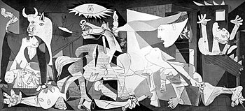
On a comparative note, I found that Coe's "The Last Dance" struck a resemblance to Pablo Picasso's "Guernica," painted in 1937 and posted below.


My primary reason for thinking of "Guernica" was the diagonal light source present in the middle of the painting, highlighting an animal in distress. The nudity, contortion, and overall disturbed feel to the other figures assist in making this comparison. As Coe produced her work approximately fifty years after Picasso's famous piece, it is entirely possible that she was inspired by it. On a conceptual level, this would make sense, as "Guernica" was painted to address the travesty facing Guernica, Spain, after a bombing, and to make note of the consequences of war as a whole. As stated earlier, Coe does emphasize political themes in her work, especially animal cruelty, so this does make sense.